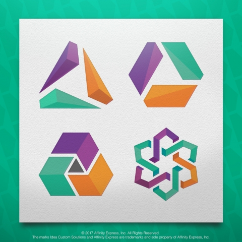
If you read our weekly blogs or follow Idea Custom Solutions on social media, you know we like to talk about the topic of rebranding. With all of the logo changes that occurred over the past few years, we have much to discuss!

Major companies including Kraft and Heinz Foods have merged, while tech stars Spotify, Google and others have put the world on the edge of their seats with the unveiling of new logos.
Sports teams in pro football, basketball and college sports are rebranding and so are America's towns and regional business hubs such as Richmond, Newark Delaware, and Dallas/Ft. Worth. And, not to be left out, educational institutions and non-profits consider their brands just as crucial to their success as multinational corporations do.
But a rebrand can be set in motion by different initiatives. In addition to corporate mergers or some companies' needs to revamp older logos, sometimes the idea of simplicity comes into play. We've noticed that frequently, especially over the last year, companies and institutions are paring down logos or streamlining their looks with crisper, less showy fonts.
Brand New and Under Consideration, which review logo changes among big brands as well as small businesses and other organizations, have both kept abreast of some of the more remarkable rebrand simplifications as of late.
Take Pinterest, the popular visual social media channel. It recently redesigned around its iconic red, circular "P" logo, keeping it intact while opting for a crisper and simpler sans serif font next to it.
Also this summer Joann Fabric and Craft Stores, a national chain that has been around for 75 years, rebranded as simply JOANN. More importantly, the retailer opted to change its logo but keep the same feel, choosing a sans serif font similar its previous logo. They also traded in a dark hunter green for a brighter one.
A year ago Australian airline Qantas reworked its logo ever so slightly— made up of an airplane's tail fin and its name — to mark the introduction of new airplanes to its global fleet.
Yet simplicity isn't just critical for logos made up of fonts or letters. Just a month ago Fortune declared that the logo is "the most important quarter inch [of space] in business". To elaborate on the point, the magazine identifies the "10 most memorable logos" and makes note of the fact that eight of the ten, such as Nike, Apple, Target and Microsoft, all have a simple shape. Meanwhile the two made up of letters — Coca-Cola and Amazon — are equally simple in design and color choice.
Other major brand logos like Twitter, NBC and PBS all have simple but unique logos that stand out and are memorable. Let's not forget General Motors, or "GM", whose major corporate brand logo is about as simple as it comes, which perhaps is what lets GM's lines like Chevy and Cadillac be more showy and playful with their logos.
Some other key points to branding and rebranding:
• Don't be hasty, be who you are and let that shine in your logo and brand.
• Don't be too similar to other logos and brands or too complex.
• Don't hire or use amateurs.
Most of all, whether you are the entrepreneur of a new business or a marketing services provider who serves them, remember that a good brand often starts simple and builds from there. Furthermore, having a skilled partner for logo design and production can make all the difference.

Add new comment