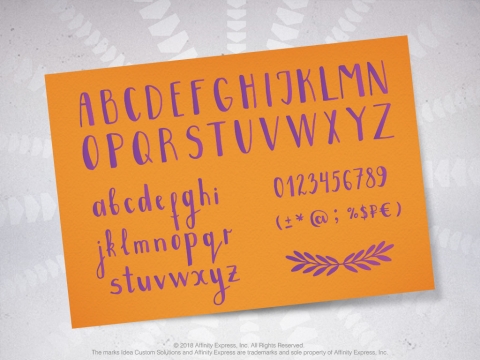
Typography is more than the font options in the drop-down menu of a Word document or the Adobe Creative Suite. There is far more complexity to each font that it is important to know before you make selections for your small business or your customers. Typefaces have personality and can evoke emotion and even inspire potential customers.

Like a doctor going through medical school and learning the complex systems and functions of the body, designers study the anatomy and styles of typography when learning their trade. Below you will find a crash course in typography terms that every new designer and font geek should know.
Anatomy of a Font
Let’s have a quick run through of the “head, shoulders, knees and toes” of a font. A character, or the letter, number or punctuation mark of a font, is comprised of strokes that each have a term — like a body would have terms for limbs. Below you will find the anatomical terms for letters.
- Leg: Attached at one end and free at another, this portion of a letter is the part that extends downwards. Think the downward line of the letter k.
- Arm: The portion of a letter that extends up or out in a straight or curved line, it is attached at one end and free at another (i.e., the letter v).
- Ear: In some typefaces, the lowercase g has a small stroke that extends outwards. This is known as the “ear.”
- Shoulder: The “shoulder” is the section of lowercase letters h, m and n that curves downwards and to the right.
- Tail: Also known as a descender, the tail is the decorative descender of capital letters Q, R and K, and lowercase letters g, j, p, q and y.
- Spine: This is the curve in the middle of the letter S.
If you are a visual learner, MarketingProfs has an excellent infographic that illustrates each term.
Typography Design Terms for New Designers
Now that we know what comprises each letter, we can start getting a little more complex with typeface design terms. These terms will give you a better idea how designers use the typefaces for logos or other creative media produced for your business.
- Cap Height. The cap height is the measurement of all capital letters in a typeface.
- X-Height. This the term for measurement of all lowercase letters in a typeface.
- Baseline. The line in which the “feet” of your capital letters are placed is called the baseline, whereas what are found below the baseline are descenders and loops.
- Ascender. This is the vertical stroke that extends up above the x-height.
- Descender. The vertical stroke that falls below the x-height or baseline is the descender.
- Bar. The horizontal line in letters like A, H, e and f is referred to as the bar.
- Bowl. A stroke that creates a curved, enclosed space in letters d, b, o, D and B is a bowl.
- Counter. The counter is the negative space formed from the closures of letters such as a, b, d, o, and q, which can also be formed by “bowls”.
- Kerning. Kerning is the act of adjusting the space between characters to establish a coordinated pairing.
- Leading. The term “leading” comes from when actual strips of lead were used to space lines of text vertically. Today, the term describes the vertical space between each line of type.
- Serif. You may be familiar with this term or “sans-serif,” which means no serif in typefaces. A serif is a short line added at the beginning and end of letters. Serif typefaces are largely popular in print and are almost universally used for running body text because they are deemed easier to read. Sans-serif typefaces typically dominate digital platforms.
- Tracking. Spacing evenly applied to all characters is known as tracking
If you are hungry for even MORE typography design terms, Creative Bloq has an entire typography glossary for you to reference as you build your design knowledge.
After reading this post, you may have a new appreciation (dare we say love?) for typography and may find that your business font needs some TLC or your customers’ brands need sprucing. Our best advice is to rely on professionals. Idea Custom Solutions provides custom logo designs created by our full-time employees, which include typefaces to inspire the right emotions in customers.

Add new comment