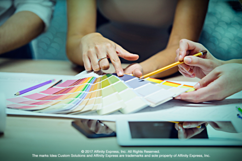
What do the colors of a brand, logo and business say? What kind of messaging do brand colors convey to current customers, future customers and would-be customers? And what do they say about what a company stands for?

The good news is that there are no inherently "good" or "bad" colors, according to experts. Rather it's all about choosing the colors that say what companies want to say and then making them effective.
An infographic on colors published by Column Five Media, shares some interesting statistics. For example, 95 percent of brands use only one or two colors. Almost one-third use blue, while 29 percent use red and 28 percent use some shade of black or grayscale.
Furthermore, the infographic looks at specific uses for logos paired with different media and assets, in regard to the brands’ industries. For firms in the clothing and apparel space, darker and earthier shades such as brown and black work well with their logos and brand marks. Meanwhile, yellow and red seem most effective for restaurants and businesses in the food sector — think McDonald's, Applebee’s and most pizza chains. Blue, purple and green, on the other hand, are a good fit for technology and energy-related companies.
In a post titled "How to Choose the Right Logo for Your Business", Forbes wrote about all of the important elements of logos, including the fonts or typefaces and shapes. But Forbes stressed that the colors chosen for logos ultimately fuse everything together to influence the messaging to customers, while letting the entities’ personalities shine.
Colors in and of themselves have personality. In fact, according to a Fast Company infographic, 80 percent of consumers say that color increases brand recognition.
Forbes also talked about evoking emotions. Based on another study cited, it laid out what a color can mean when processed by the minds of prospective customers:
- Red stands out as exciting, bold and youthful.
- Orange communicates friendly, cheerful and confident.
- Yellow brings optimism, clarity and warmth.
- Green represents peace, health and growth.
- Blue evokes trust, dependability and strength.
- Purple says creative, imaginative and wise.
- Black and white together emits balance and calm.
Even the shades of colors, meaning specifically their darkness and saturation, can affect the nuances of brand marks, Forbes also wrote. It mentioned the use of blue as an example.
"The Gap blue is a classic navy, Google’s is a fun, bright blue and my company uses a pastel sky blue." Forbes noted that, "women prefer soft colors while men prefer bright colors. Similarly, women prefer shades (colors mixed with white) while men prefer tints (colors mixed with black)."
Taking the discussion a step further, Creative Bloq makes a bolder claim.
"Successfully 'owning' a colour is a big deal," and that making colors synonymous with brands, versus just choosing colors, is "how a succession of top brands have staked their claim."
In the post, Nick Carson, the editor of Computer Arts magazine, points out that some iconic brands are fused with colors as much as with unique names. For example, when you think Coca-Cola, even if you lean toward calling it "Coke", you think red. Likewise, Starbucks calls to mind green and UPS equals brown, from packages to trucks to UPS employees’ uniforms.
While the typical small business couldn’t imagine competing dollar-wise with what these mega-corporations spend on marketing, that doesn't mean that small or medium-sized businesses (SMB) can't have stand-out logos that make a splash!
When designing new company logos or re-branding, it makes sense to consult pros to achieve the best results. According to U.S. News & World Report, it's best to enlist experts.
Every year Idea Custom Solutions helps SMBs harness the power of color and creativity to re-brand or launch new logos. Rather than do-it-yourself, templates or software driven outputs, we offer an agency-quality service, from a dedicated professional team, at a price any company can afford!

Add new comment