
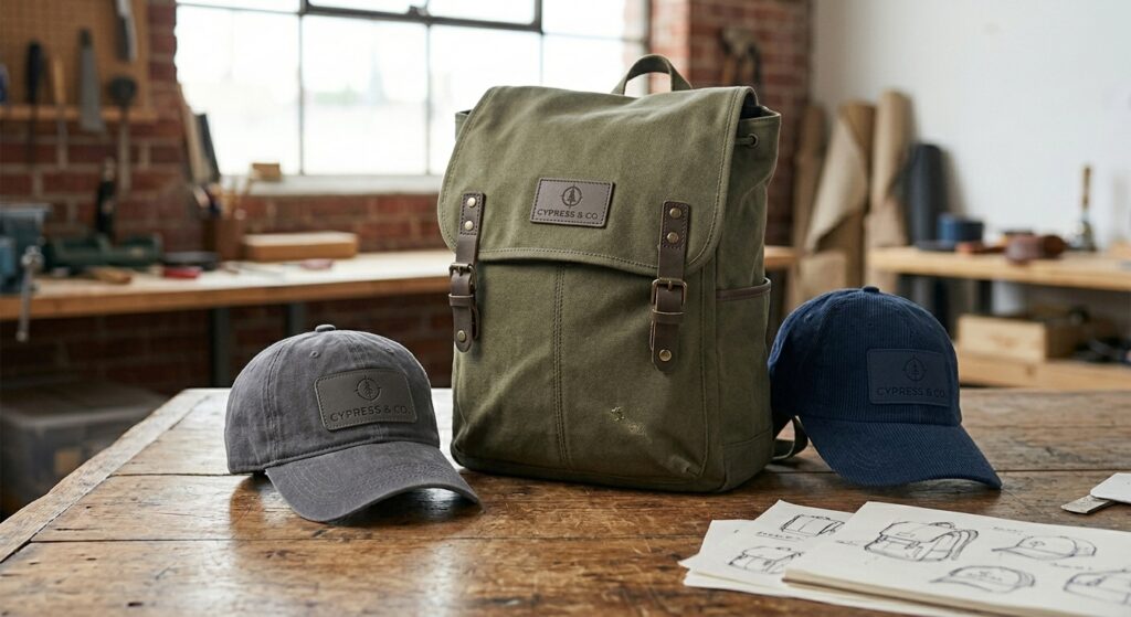
The biggest merch trends of 2026 point to a more refined, design-led approach replacing bold logos and loud branding. Subtle logo placement, tone-on-tone finishes, and texture-based branding like debossing or engraving are increasingly preferred, especially for B2B audiences, according to a 2026 branded merchandise trends report from Limelight Publicity.
That’s a real shift from the instinct most buyers still default to: bigger logo, more visibility, better marketing. The data on how people actually use branded merch tells a different story. A logo that dominates a shirt or a mug reads as an advertisement, and an advertisement is easy to set aside. A design that looks like something someone would actually choose to wear gets worn.
That shift isn’t about hiding the brand. It’s about earning attention through quality and restraint instead of demanding it through size and contrast, and the two approaches produce very different results once the item leaves the box.
What Do 2026 Merch Trends Look Like in Practice?
Small logo placements, tone-on-tone finishes, and texture over color.
- Placement: a logo printed down the sleeve of a hoodie instead of across the chest, or tucked at the cuff instead of centered.
- Tone-on-tone embroidery: the logo and the fabric sit in close, related shades instead of high contrast, so the mark reads more like texture than announcement.
- Texture-based branding: debossing, engraving, or subtle raised finishes instead of flat color, especially on drinkware and hard goods.
- Neutral palettes: fewer, more deliberate colors that feel closer to what someone would already choose off a retail shelf.
None of these techniques hide the brand. They just stop treating the logo as the entire design, the way a well-made retail garment treats its own branding as one detail among several, not the whole point of the piece.
Minimal Branding Is Trending Now Because the Production Quality Finally Supports It
Because buyers finally have the production techniques to make subtlety look intentional instead of cheap.
A tiny logo on a low-quality garment used to just look like a missed opportunity, easy to overlook and forgettable either way. The techniques behind subtle branding today, tone-on-tone embroidery, fine debossing, high-definition small-scale prints, only work when the underlying product and execution are good enough to reward a closer look. That’s a production capability question as much as a design preference. The trend didn’t just become popular, it became achievable at the quality level it actually needs.
Does a smaller logo actually mean less brand exposure?
No. Minimal branding tends to extend how long a product stays in someone’s regular rotation, according to a 2026 promotional product trends analysis from CFJ Manufacturing.
That’s the counterintuitive part. A bold, chest-wide logo gets a garment worn once or twice, then relegated to the back of a closet. A subtle version of the same logo, on a piece someone would actually choose to wear regularly, gets far more real-world impressions over the life of the item. Fewer people notice it in any single moment, but far more people see it over time, because the item stays in use instead of getting set aside.
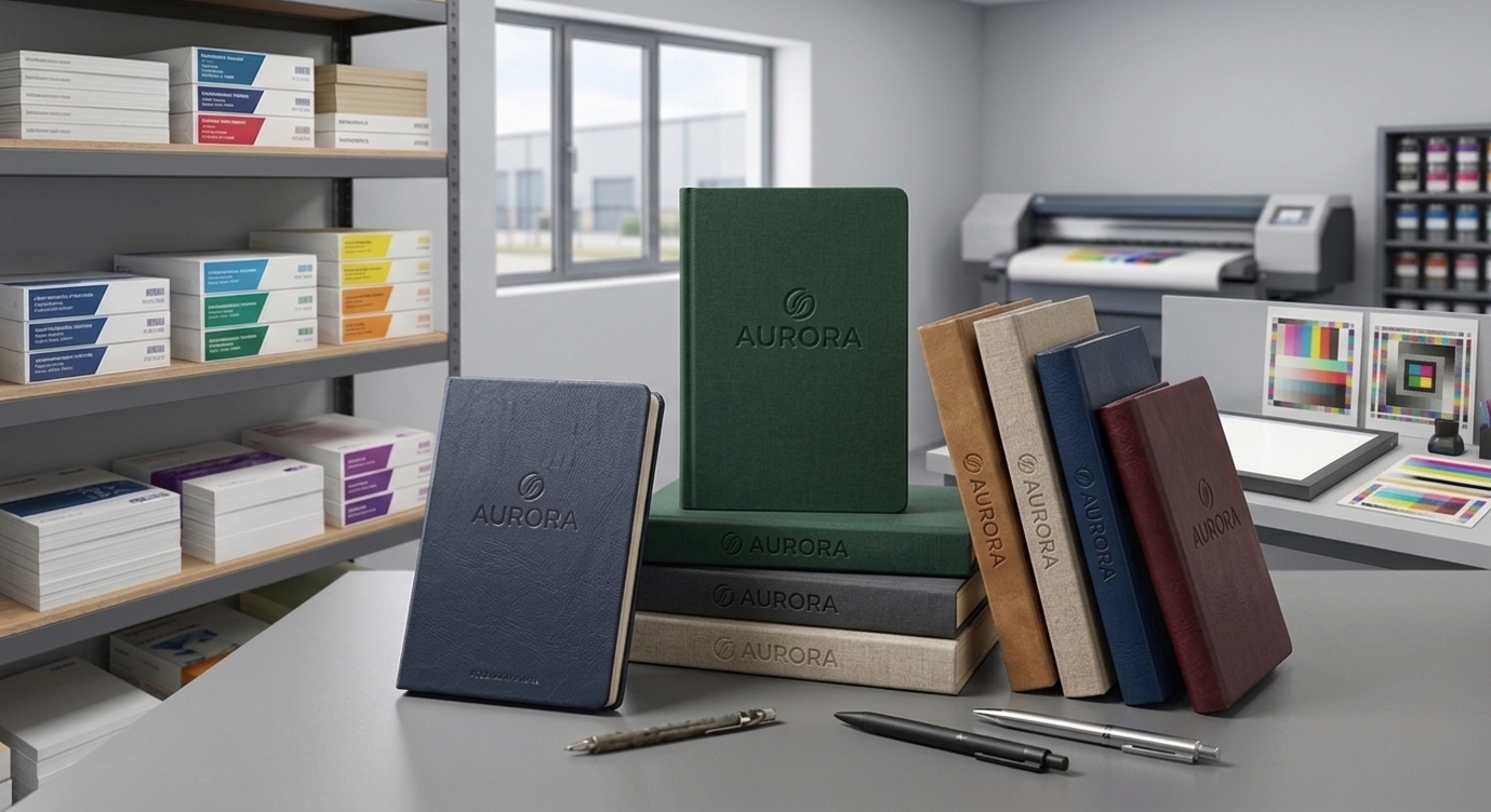
Borrowed Retail Credibility Is a Big Part of Why Subtle Branding Reads as Premium
A recipient treats a retail-quality piece very differently than one that reads as an obvious giveaway.
Well-known retail brands carry existing trust and desirability before a logo ever enters the picture. Branded merchandise that’s designed to look like something from a retail shelf, rather than something clearly manufactured for a giveaway, borrows some of that same credibility. A recipient treats a piece that looks retail-quality differently than one that reads as an obvious promotional item, and that difference in perception starts with restraint in how the logo is applied, not with the logo itself.
Is this actually a new idea, or has it just reached promotional merchandise recently?
The philosophy behind it is old. The specific version showing up in branded merch is recent.
“Quiet luxury” as a named retail movement traces to around 2023, and a 2026 industry analysis of promotional merchandise trends notes it has since found its place in the branded merchandise world specifically. But the underlying idea, that genuine quality doesn’t need to shout, is much older than that label. “This isn’t new, it’s just new to our industry,” says AffinityX’s Creative Director. “Luxury brands have practiced this kind of restraint for decades. We’re only now catching up to what they’ve always known: that confidence doesn’t need to be loud to be seen.” What’s new isn’t the philosophy. It’s that promotional merchandise finally has the production quality to borrow it convincingly.
AffinityX’s Creative Leadership Expects This to Keep Going Into 2027
AffinityX’s own creative leadership doesn’t see this as a passing moment.
Quiet luxury has held steady as a dominant force in the broader luxury market through 2026, with coverage of the 2027 model year in adjacent luxury categories like automotive still describing it as highly relevant rather than fading. Inside promotional merchandise specifically, the shift away from large, logo-centric designs has been described as gaining momentum through 2026, not leveling off. “We feel this is here to stay,” says AffinityX’s Creative Director. “This isn’t a seasonal shift or a fad we’ll be writing a different post about next year. It’s a permanent change in how quality gets communicated, and we expect it to keep gaining ground through 2027 and beyond.”
Which embroidery techniques actually create a true tone-on-tone effect?
Gradient work and precise thread-to-fabric color matching, not just picking a thread that looks close.
Gradient is one of the specialty embroidery techniques that goes beyond a standard fill stitch, creating subtle blended color transitions rather than a flat, single-tone block. That’s exactly the effect tone-on-tone branding depends on: a logo that reads as texture and shading rather than a hard-edged mark in a contrasting color. Getting it right takes the same digitizing discipline that separates good embroidery from great embroidery generally, stitch density and color control that hold up close, not just from a distance. A tone-on-tone design digitized carelessly just looks like a mistake, not a subtle design choice.
Subtle Branding Sometimes Costs a Little More, But Not Because Subtlety Itself Is Expensive
A flat, high-contrast print in one or two colors is often the cheapest option to produce at volume.
Texture-based techniques like fine debossing or tone-on-tone embroidery can require more precise setup and digitizing work than a bold flat design, which sometimes shows up as a modest cost difference. But the gap isn’t as wide as buyers tend to assume, and it’s frequently offset by needing fewer colors and simpler placement than an elaborate bold design would require. The more relevant cost question is usually about the material and technique combination, not whether the branding is subtle or bold in general.
Fun fact: When a subtle, high-definition design is paired with genuinely good material quality, the effect flips entirely: instead of reading as an advertisement someone is wearing, the piece reads as something someone genuinely chose, with the brand as an implicit detail rather than the headline.
Is subtle branding right for every audience?
It’s especially strong for B2B audiences, less universal for consumer-facing visibility campaigns.
Subtle branding is increasingly preferred specifically for B2B audiences, where the goal is often building a longer-term impression of quality and trust rather than maximum visibility in a crowd. A campaign built specifically around visibility, a trade show giveaway meant to be spotted across a room, or a promotional push where the logo itself is the message, still has a real case for bolder, more visible branding. The right choice depends on what the piece is actually meant to accomplish, not a blanket rule that smaller is always better.
Ask for Specific Placement and Technique Options, Not Just a Smaller Logo
A vague request just gets a smaller version of whatever was already planned.
- Placement options: sleeve, cuff, chest-pocket scale, or tag, rather than a default centered chest placement.
- Technique options: tone-on-tone embroidery, debossing, engraving, or a fine high-definition print, depending on the material.
- Palette guidance: a tight, deliberate color set rather than the brand’s full palette applied at full contrast.
- A physical or high-quality virtual sample before full production, since subtle branding lives or dies on execution quality that’s hard to judge from a flat mockup alone.
That last point matters more for subtle branding than bold branding. A bold logo reads clearly even in a rough mockup. A tone-on-tone design or a fine debossed mark needs to be seen at real scale and lighting to judge whether it actually reads the way it’s supposed to.
How does a buyer avoid subtle branding that reads as invisible instead of intentional?
By testing the design at the item’s actual size and material, not just on screen.
The line between subtle and invisible is thin, and it moves depending on the material, the lighting, and the scale of the item. A tone-on-tone mark that reads clearly on a large tote bag can disappear entirely on a small pen. A debossed logo that looks crisp under studio lighting can go flat under normal indoor light. That’s why a physical sample, or at minimum a high-quality virtual sample viewed at actual scale, matters more here than it does for a bold, high-contrast design that’s forgiving of small production variations.
Frequently Asked Questions
What counts as subtle branding on promotional merchandise?
Tone-on-tone embroidery, small logo placements off the chest, and texture-based techniques like debossing or engraving, used in place of a large, high-contrast logo that dominates the piece.
Does a smaller logo mean less brand exposure?
No. Minimal branding tends to extend how long a product stays in someone’s regular rotation, which means more real-world impressions over time, not fewer, even though any single glance is less obvious than a bold logo would be.
Is subtle branding a good fit for every type of order?
It works especially well for B2B audiences and premium gifting. Bolder, more visible branding still has a place for campaigns where maximum visibility in a crowd is the actual goal.
Sources: Limelight Publicity, “Branded Merchandise Trends 2026” (January 2026); CFJ Manufacturing, “5 Promotional Product Trends to Watch in 2026” (February 2026); Limelight Publicity, “The Merch Trends That Won the First Half of 2026” (August 2026); KSM Promotions, “Top 2026 Company Swag Trends To Know” (January 2026); JustLuxe, “2026 Luxury Auto Annual Trends and 2027 Key Themes” (2026, quiet luxury continuation context); commentary from AffinityX’s Creative Director.